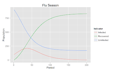
 # The SIR Model (susceptible, infected, and recovered) model is a common and useful tool in epidemiological modelling.
# In this post and in future posts I hope to explore how this basic model can be enriched by including different population groups or disease vectors.
# Simulation Population Parameters:
# Proportion Susceptible
Sp = .9
# Proportion Infected
Ip = .1
# Population
N = 1000
# Number of periods
r = 200
# Number of pieces in each time period.
# A dynamic model can be simulated by dividing each dynamic period into a sufficient number of discrete pieces.
# As the number of pieces approaches infinity then the differences between the simulated outcome and the outcome achieved by solving the dynamic equations approaches zero.
np = 1
# Model - Dynamic Change
DS = function() -B*C*S*I/N
DI = function() (B*C*S*I/N) - v*I
DZ = function() v*I
# I is the number of people infected, N the number of people in total, S is the number of people susceptible for infection, and Z is the number of people immune to the infection (from already recovering from the infection).
# Model Parameters:
# Transmition rate from contact with an infected individual.
B = .2
# Contact rate. The number of people that someone becomes in contact with sufficiently to recieve transmition.
C = .5
# Recovery rate. Meaning the average person will recover in 20 days (3 weeks).
# This would have to be a particularly virolent form of the flu (not impossible at all).
v = .05
# Initial populations:
# Sesceptible population, Sv is a vector while S is the population values as the current period
Sv = S = Sp*N
# Infected, Iv is a vector while I is the population values as the current period
Iv = I = Ip*N
# Initial immunity.
Zv = Z = 0
# Now let's how the model works.
# Loop through periods
for (p in 1:r) {
# Loop through parts of periods
for (pp in 1:np) {
# Calculate the change values
ds = DS()/np
di = DI()/np
dz = DZ()/np
# Change the total populations
S = S + ds
I = I + di
Z = Z + dz
# Save the changes in vector form
Sv = c(Sv, S)
Iv = c(Iv, I)
Zv = c(Zv, Z)
}
}
# ggplot2 generates easily high quality graphics
require(ggplot2)
# Save the data to a data frame for easy manipulation with ggplot
mydata = data.frame(Period=rep((1:length(Sv))/np,3), Population = c(Sv, Iv, Zv), Indicator=rep(c("Uninfected", "Infected", "Recovered"), each=length(Sv)))
# This sets up the plot but does not actually graph anything yet.
p = ggplot(mydata, aes(x=Period, y=Population, group=Indicator))
# Adding the geom_line plots the lines changing the color or the plot for each indicator (population group)
p + geom_line(aes(colour = Indicator)) + ggtitle("Flu Season")
# Save initial graph:
ggsave(file="2013-05-14flu.png")
# Let's do some back of the envelope cost calculations.
# Let's say the cost of being infected with the flu is about $10 a day (a low estimate) in terms of lost productivity as well as expenses on treatment.
# This amounts to:
sum(Iv/np)*10
# Which is a cost of $165,663.40 over an entire flu season for the thousand people in our simulated sample.
# Or about $165 per person.
# Imagine if we could now do a public service intervention.
# Telling people to wash their hands, practice social distancing, and avoid touching their noses and eyes, and staying at home when ill.
# Let's say people take up these practices and it reduces the number of potential exposure periods per contact by half.
C = .25
# ....
p + geom_line(aes(colour = Indicator)) + ggtitle("Flu Season with Prevention")
# Save initial graph:
ggsave(file="2013-05-14flu2.png")
# ....
sum(Iv/np)*10
# Which is a cost of $76,331.58 over an entire flu season for the thousand people in our simulated sample or about 76 dollars per person.
# The difference in costs is about 89 thousand dollars for the whole population or on average 89 per person. The argument is therefore, so long as a public service intervention that reduces personal contact costs less than 89 thousand dollars for those 1000 people, then it is an efficient intervention (at least by the made up parameters I have here).


You should have a look at package simecol.
ReplyDeleteIt is especially suited for this type of model simulation.
Berend
Ah cool, thanks Berend!
DeleteFrancis
Thank you! I have been trying to understand this for a while now and it finally makes sense, thanks to you!
ReplyDeleteBelieve it or not, writing this simulation had the same effect for me :)
DeleteHi Francis, I've enjoyed your blog for some time now. I was wondering if you've ever written about simulations for power calculations? In particular for clustered designs, and also so-called "encouragement designs"--in which, for instance, an incentive is offered for participating in a treatment and that incentive is then used as an instrumental variable for the treatment?
ReplyDeleteThanks!
Hi Peter, that is a really great idea. I have not done any power analysis using R though I did have one post looking at power analysis with Stata: Power Analysis with Non-Linear Least Squares: A Simulation Approach
DeleteI might try to post something on the topic in the near future.
Thanks Francis, I look forward to that if you do! I have been looking into this using Stata as well, so I will read through the post you linked to above.
ReplyDeleteThanks again,
Peter
SIR models are interesting, this is a cool demonstration, thanks for sharing
ReplyDeleteHelp me please! I can't run this project in RStudio. Tell me please instruction step-by-step to run this project. Thanks!
ReplyDeleteCould you tell me a little more about the errors you are experiencing?
Delete1. Copy and paste code
2. Install ggplot2 package
3. Run code