Showing posts with label shiny. Show all posts

Tuesday, March 19, 2019

The importance of Graphing Your Data - Anscombe's Clever Quartet!


Francis Anscombe's seminal paper on "Graphs in Statistical" analysis (American Statistician, 1973) effectively makes the case that looking at summary statistics of data is insufficient to identify the relationship between variables. He demonstrates this by generating four different data sets (Anscombe's quartet) which have nearly identical summary statistics. His data have the same mean and variance for x and y, same correlations between x and y, and same regression coefficients on the linear projection of x on y. (There are certainly additional summary statistics less widely reported such as kurtosis or least absolute deviations/median regression which were not reported which would have indicated differences between the data.) Yet even with these differences, without graphing the data, any analysis would likely be missing the mark.

I found myself easily convinced by the strength of his arguments yet also curious as to how he produced the sample data that fit his statistical argument so perfectly. Given that he had only 11 points of data, I am drawn to think he played around with the data by hand till it fit his needs. This is suggested by the lack of precision on the statistics of the generated data (Anscombe's quartet).

If he could do it by hand, I should be able to do it through algorithm!

The benefits of having such an algorithm would be that I generate an arbitrary number of datasets and data that exactly fit specific sample parameters. I tried a few different methods of producing the data that I wanted.

Method 1 - randomly draw some points then select the remaining - fail

One method was to select just the last point or two from a set of data, say I wanted  to draw 11 X points with with mean 9 and variance 11 as found in the data. I attempted to draw 10 points then adjust the mean and variance by selectively drawing the 11th point. This approach however quickly fails as it relies too much on the 11th point. Say the mean from the first draws was unusually low with a mean of 8. In order to weight the sample mean back to 9 the 11th point would therefore need to be 19 in order to balance the x values at 9. Then you have to somehow figure out how to manage the variance which you know is already going to be blown up by the presence of my 11th value.

Method 2 - use optimization to select points which match the desired outcome - fail

Next I tried some search algorithms trying to use computation to search for possible values that fit my needed data. This was a highly problematic attempt that failed to produce any useful results.

Method 3 - brute force, randomly generate data - fail

The intent of the approach was to get data close to target parameters, then modifying individual data points to match desired properties.

Method 4 - modify random data to meet parameter specifications

Fortunately, after a little reflection I realized the smarter approach was to make use of what I know about means and variances as well as correlations to modifying the sample to fit my desired outcome. For instance, no matter what x I started with (so long as x had any variation) I could adjust it to fit my needs. If the mean of x needs to be mu_X. Then we can force it to be that:
$$ (1) X = X-mean(X) + \mu_X $$

Slightly more challenging, we could modify the variance of x by scaling the demeaned values of the sample. Since we know that
$$ (2) Var(aX)=a^2 * Var(X) $$
Define a to be a multiplicative scalar for x
$$(3) a = (\sigma^2_X/Var(X))^{1/2}$$

Using identities we can figure out how to modify the error term u in order to always return the desired regression values as well as the correct correlations (for more explanation see first fifty lines of notes in coding file).

Through use of such an algorithm we can feed in any draw of X and any dependency between X and U and we will get the same regression results:
Mean(X) = 9, Var(X) = 7.5, B0 = 3, B1 = .5, COR(X,Y)=.8.

Sample Data - Using Ascombe's Parameters


Sample data drawn to generate the following graphs can be found here.

The statistical results in R are displayed as follows. These results are designed to be exactly identical regardless of how the data is generated.

Table 1:

Call: lm(formula = y ~ x, data = xy8)

Coefficients:
            Estimate Std. Error t value Pr(>|t|)    
(Intercept)  3.00000    0.51854   5.785 5.32e-07 ***
x            0.50000    0.05413   9.238 3.18e-12 ***
---
Signif. codes:  0 ‘***’ 0.001 ‘**’ 0.01 ‘*’ 0.05 ‘.’ 0.1 ‘ ’ 1

Residual standard error: 1.257 on 48 degrees of freedom
Multiple R-squared:   0.64, Adjusted R-squared:  0.6325 
F-statistic: 85.33 on 1 and 48 DF,  p-value: 3.18e-12


Since we cannot see any difference from looking at standard descriptive statistics, lets see how the data looks when graphed.
Figure 1: Graphs 1-4 are recreations of Anscome's Quartet. 5-8 are new.
Figures 1-4 are recreations of Anscombe's Quartet. Figure 1 is what we are often times thinking our data should look like in our heads. Figure 2 is a situation in which there is a nonlinear relationship between x and y which should be examined. Figure 3 could present a problem since there is no variation in x except one observation which drives all of the explanatory value of the regression. Figure 4 is similar except now there is variation in x and in y. However the relationship between the values is distorted by the presence of a single powerful outlier.

Figures 5-8 are figures I came up with. Figure 5 features a weak linear relationship between x and y which is exaggerated by a single outlier. Figure 6 is a negative log. Figure 7 is a example of heteroskedasticity. Figure 8 is an example of x taking only one of two values. 

Anscome emphasizes that the funkiness of the data does not necessarily mean the inference is not valid. That said, ideally removing a single point of data should not significantly change inference. Yet, researchers should know what their data looks like.

As for figure 7, generally we do not expect heroskedastic errors to present inference bias. Rather they suggest that using heteroskedasticity robust or White-Huber standard errors might improve the efficiency of our estimates (generally speaking).

Sample Data - Using Negative Slope Parameters


Sample data is drawn from the same parameters except that now the slope is negative. 

Table 2: 
Call: lm(formula = y ~ x, data = xy1)

Residuals:
    Min      1Q  Median      3Q     Max 
-2.3862 -0.6586 -0.2338  0.5721  3.6159 

Coefficients:
            Estimate Std. Error t value Pr(>|t|)    
(Intercept)  3.00000    0.51854   5.785 5.32e-07 ***
x           -0.50000    0.05413  -9.238 3.18e-12 ***
---
Signif. codes:  0 ‘***’ 0.001 ‘**’ 0.01 ‘*’ 0.05 ‘.’ 0.1 ‘ ’ 1

Residual standard error: 1.257 on 48 degrees of freedom
Multiple R-squared:   0.64, Adjusted R-squared:  0.6325 
F-statistic: 85.33 on 1 and 48 DF,  p-value: 3.18e-12

We can see that changing the slope to negative does not change any of the other statistics.

Figure 2: Same as figure 1 except B1 = -0.5

Summary

Graph your data! If not presenting graphs in your final analysis at least graph it in the exploration phase. Ideally, presenters of data and analysis have some mastery of tools of data exploration and interaction which can presented with data (such as interactive data interfaces Shiny or Tableau).

Such supplementary data found in graphs will likely not be the basis of whether the arguments you are making through statistics are valid, but they will add credibility.

CODE

Find my code for generating exact linear relationships between XY regardless of the dependency of the errors U and X (u|x).

Friday, October 3, 2014

Ebola: Beds, Labs, and Warnings? Can they help? (Shiny App)

A month ago when the WHO was projecting estimates of the effect of current outbreak of Ebola being as deadly as affecting 20,000 people, I ran some elementary modelling and found that these estimates are far too small given the current trend.  The motivation for the post was to raise awareness that situation could get far worse than anybody was talking about at the time. Since then, most of my 'back of the envelope' estimates have ended up being disturbingly close to reports the World Health Organization has been releasing.

https://econometricsbysimulation.shinyapps.io/Ebola-Dynamic-Model/

Which frankly is extremely scary. Currently I am living in Mozambique in Southern Africa and though Mozambique is slightly more developed than Liberia, I have no reason to believe that things would be any different here than in Western Africa if an outbreak went undetected for a month as it did in Western Africa.

This among other things has made me wonder how inevitable such an outcome is. Should everybody who can leave Africa and find a nice little bunker to hide in until this whole thing passes? Well probably not but only if Ebola can be stopped.

Currently the world seems to be responding to the crisis in the countries affect in three major ways: 1. provide beds, 2. provide laboratory capabilities to diagnose Ebola, and 3. provide advertisements to increase awareness. But how can we know how effective these measures can be against such a seemly unstoppable force?

Time to break out our models!

Unfortunately there is no really easy way to model this. However, modifying the standard epidemiological SIR (susceptible, infected, recovered) model I am able create a model which looks to be functioning the way we would like it to by including some additional parameters. To see details of the model's construction, see the technical appendix.

Beds

The primary new parameters of consideration are 'beds' which represent the number of beds available as well as the food and supplies necessary in order to feed people who are residents of these beds. Infected individuals once detected are transferred to quarantine if beds are available. If they are not available then infected individuals remain contagious until they recover or die.

Social adoption
From a paper by Fisman, Khoo, and Tuite I have incorporated the idea of social adaption to the epidemic. This captures the concept that the infection could be naturally controlled to some extent by changes in the behavior of the susceptible population and that of the contagious population.

The Model
It becomes immediately clear that the model is extremely sensitive to just about every parameter included. If the infection rate is too high then everybody gets sick. If the rate is too low then the epidemic is quickly contained. However, for this exercise let us assume we cannot directly control in any way infection rates but we can choose how many beds, how effective we are at detecting new cases, and we have some influence on how people respond over time to Ebola by taking safety precautions such as not touching the sick or dying.

Figure 1:Base Model After 9 Months

Each of these interventions can have a significant effect on the outbreak. These interventions when looked at carefully turn into two different strategies: 1. Quarantine infected by providing beds and provisions and 2. increasing public awareness to reduce probability of spread over time.

Providing Beds
The effect of a significant investment in beds (500 new beds) after seven months can abruptly turn around the spread of Ebola as the contagious population is rapidly shifted from free and dangerous to safely quarantined (assuming an effective mechanism exists for detecting those who are ill).

Figure 2: Base model after seven month beds intervention.
Changing Behavior
I have not including behavior curbing into the model quite as dramatically. Instead I have specified social behavior changes as a cumulative effect over time. In the base model individuals adapt to the disease by being .03% less likely each day to contract the disease. This is not much though it does accumulate significantly over time. After six months of the epidemic individuals would be about 5% less likely to get Ebola when exposed to an individual with Ebola.

If we are able to increase awareness about prevention of contraction of the disease to say .06% increase per day then individuals are about 10% less likely to contract Ebola after six months. Though these numbers are not large the effect can be profound on our model.

Figure 3: Behavioral adaption can dramatically reduce the lifespan of the outbreak.

However, the significant problem with including social adaption in this way is that this is based on accumulated actions over time. If this is the case then Ebola should already but or its way out.

Sensitivity of the Model - the shiny app
As mentioned previously this model is extremely sensitive to parameter choices. It is therefore more of an illustrative tool than actually meant to exactly represent the situation in Western Africa. As a tool we can see under the right circumstances that beds and public information can have a dramatic effect on the spread of Ebola. However, don't take my word for it! Check out the app below and play around with the model yourself.


https://econometricsbysimulation.shinyapps.io/Ebola-Dynamic-Model/


Technical Appendix
Parameters:
alpha is detection rate.
delta is transition rate to recovery or death.
mu is mortality rate.

State equations:
Change in susceptible population:
$$\dot S = -\frac{\gamma S_R S_t C_t}{S_t C_t}$$

Change in contagious population:
$$\dot C = -\dot S-\min[\alpha C_t , \max(beds-Q_t(1-\delta),0)]-\delta C_t$$

Change in the quarantined population:
$$\dot Q = \min[\alpha C_t , \max(beds-Q_t(1-\delta),0)] - \delta Q_t$$

Change in the recovered population:
$$\dot R = (1-\mu) \delta (Q_t+C_t)$$

Change in the decease population:
$$\dot D = \mu \delta (Q_t+C_t)$$

R Code
The R code used to produce this app can be found on Github. If you prefer running the app from your computer, you can download server.R and ui.R and run the package from your own

Thursday, July 17, 2014

RStudio Webinar with Hadley Wickham: The Grammar and Graphics of Data Science

RStudio has recently announced a series of free webinars open to the public. The first of these
seminars is given by Hadley Wickham, Rice University Professor, RStudio Chief Scientist, and general super-star of the R development world. Contributing author of the popular R packages ggplot2, plyr, testhat, reshape, and several of the other most innovative and widely used R packages currently available.

The first seminar is entitled The Grammar and Graphics of Data Science and I would imagine it involving much information with regards to ggplot2 as well as many other essential graphical tools in the R environment.

Upcoming seminars include one focused on "Reproducible Reporting" for which I believe will lead to a revolution in the Social Sciences in the next decade in terms of a tremendous increase in the quality and quantity of scientific work.

The third upcoming seminar is entitled "Interactive Reporting" and is focused on the development of tools to create dynamic reporting, in particular the popular package and server environment named "shiny".

To find a link to the registration site for these webinars go to:
pages.rstudio.net/Webniar-Series-Essential-Tools-for-R.html

Friday, March 7, 2014

Ever wonder how popular your favorite R functions are?

How's that fried pickle sandwich treating you?  Perhaps your taste in R  functions are less bizarre than your taste in R commands?

Now you can easily find out using this new shiny app!  In this post I use the R function frequency table compiled by John Myles White in 2009 in which he counts the occurrences of words in the source files of all CRAN packages. 

I take his table and I modify it slightly to include a ranking system as well as a count of the number of characters in each function.  In this Shiny application you can see both frequencies of functions graphically for a user specified range as well as find within the frequency chart easily search by imputing function names.

Play with the shiny app!
https://econometricsbysimulation.shinyapps.io/FCount/
I before creating the shiny App I needed to work on the frequency data a bit:

First off get the CSV file provided by John Myles White:
http://www.johnmyleswhite.com/content/data_sets/r_function_frequencies.csv

freqTable <- read.csv("r_function_frequencies.csv")
 
freqTable<-freqTable[!is.na(freqTable[,1]),]
 
# Let's look at the data
head(freqTable)
freqTable <-freqTable[order(freqTable$Call.Count, decreasing = T),]
 
# Okay so we have over 27,000 words with some of them appearing as 
# infrequently as 12 times.  Let's make the minimum 25 occurrences.
 
# freqTable <- freqTable[freqTable$Call.Count>=25,]
 
# Convert the freqTable data from factors to letters
freqTable[,1] <- as.character(freqTable[,1])
 
# When we rank the functions by occurance we have a total of 660 
# different levels
numbers <- sort(unique(freqTable[,2]), decreasing=T)
nrank <- 1:length(numbers)
 
# This will create a ranking from 1 to length of unique frequencies
for (i in numbers) freqTable$rank[freqTable[,2]==i] <- nrank[i==numbers]
 
# Create a number of characters vector to be added to the frequency table
freqTable$nchar <- nchar(freqTable[,1])
 
# Save the table for access in Shiny
save(freqTable, file="freqTable.Rdata")
Created by Pretty R at inside-R.org

Thursday, February 6, 2014

Using MongoHQ to build a Shiny Hit Counter


In serveral previous posts I have posted shiny applications which temporarily store data on shiny servers such as hit counters or the survey tool which I created,  These do not work in the long term since shiny will restart its servers without warning when needed.  In addition, saving data to a shiny server is not an ideal method since special database specific commands should be set up to handle the simultaneous write requirements of web applications.

In this post I will show how to add an effective hit counter to shiny applications using a remote database server (MongoHQ).  Much of my code follows the MongoHQ package demo found at

Start and account with MongoHQ. A Sandbox free database account with 512 MB of memory should be more than sufficient.

Once you have started an account you need to log into app.mongohq.com and start a database as well as a collection.  Within a database you will need to select the admin tab as well in order to create a user id which you can use to log into the collection.

The following code is what I use to create a hit counter.

# Load the CRAN library
library(rmongodb)
 
# You can find the host information for the collection under the admin tab.
host <- "myarea.mongohq.com:myport"
username <- "mycreateduser"
password <- "mycreatedpassword"
db <- "mydatabase"
 
mongo <- mongo.create(host=host , db=db, username=username, password=password)
 
# Load the collection.  In this case the collection is.
collection <- "OLS-app"
namespace <- paste(db, collection, sep=".")
 
# Insert a simple entry into the collection at the time of log in
# listing the date that the collection was accessed.
b <- mongo.bson.from.list(list(platform="MongoHQ",
                    app="counter", date=toString(Sys.Date())))
ok <- mongo.insert(mongo, namespace, b)
 
# Now we query the database for the number of hits
buf <- mongo.bson.buffer.create()
mongo.bson.buffer.append(buf, "app", "counter")
query <- mongo.bson.from.buffer(buf)
counter <- mongo.count(mongo, namespace, query)
 
# I am not really sure if this is a good way of doing this
# at all.
 
# I send the number of hits to the shiny counter as a renderText
# reactive function
paste0("Hits: ", counter)
Created by Pretty R at inside-R.org

The now database run hit counter can be seen at:
http://econometricsbysimulation.shinyapps.io/OLS-App/

You can find the updated code at github
https://github.com/EconometricsBySimulation/OLS-demo-App/blob/master/server.R

Tuesday, November 19, 2013

A Survey Tool Designed Entirely in Shiny Surveying Users of R

http://econometricsbysimulation.shinyapps.io/Survey/I have written a very basic survey tool built entirely in the Shiny package of R.  I hope the tool is useful.  Modifying the survey for your own purposes is trivially easy (I hope).


I have not commented my code so it is pretty messy right now.  You can find the source on GitHub.

In order to run your own survey all you need do is edit the Qlist.csv file.  It contains one row for each question and one column for the question text and additional columns for potential answers (which will enter the radio buttons).  All of the questions will have the default option of "Prefer not to answer" selected.  It should be easy to modify this option as well since you need only find where this text appears in the server.R code.

It should be equally easy to change the introductory message and the accreditation to me, though it would be nice if you left a link somewhere back to me.

I will comment the GitHub files as soon as I have chance.  If people find this tool useful perhaps I will work on improving it.  Please tell me if you find it useful or have suggestions for future improvements!

Please take note that it is really not up in running in a sustainable way since I was recently told that sometimes the ShinyApps.io server must be restarted which means that all of the files are restored to those when the app was originally set up.


http://econometricsbysimulation.shinyapps.io/Survey/

Sunday, November 17, 2013

Alpha testing shinyapps.io - first impressions

http://econometricsbysimulation.shinyapps.io/bounce/ShinyApps.io is a new server which is currently in alpha testing to host Shiny applications.  It is being designed by the RStudio team and provides some distinct features different from that of the ShinyApps.io is intended for larger applications and I am guessing commercial applications in the long run.  Right now it is only allowing users by invitation into their alpha program, but they are accepting applicants for beta testing.
spark.rstudio server which is intended primarily for pilot testing Shiny apps. 

The way the user interacts with the system is extremely powerful.  In the standard package for shiny it is extremely easy to experiment with applications under development by simply navigating to the directory of interest with the setwd() command then trying your app with the runApp() function in the shiny library.  The new server has its own functions including the new and extremely powerful deployApp() function which acts the same as the runApp() function except that it contacts the ShinyApps server and immediately sets up a connection and deploys your app.  This makes the entire process of developing shiny applications and deploying them much easier.

I hope that this new service will further increase the user base of shiny! I think an R based interface for generating graphs will provide an invaluable tool for teaching and demonstrating empirical analysis methods.

I have been playing around with Shiny's seeming animation functionality.  I have created an animation like interface simulating the bouncing of a ball.

http://econometricsbysimulation.shinyapps.io/bounce/

GitHub Source

Friday, November 15, 2013

A Shiny App for Experimenting with Dynamic Programming

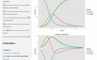
http://econometricsbysimulation.shinyapps.io/Dynamic-Pro/This post demonstrates the dynamics involved in a susceptible, infected, and recovering (SIR) model previous post for the model.  The shiny ui and server code can be found on GitHub.
of dynamic programming.

As a dynamic infection model, I find it particularly satisfying to be able change parameters and observe instantaneously changes in predicted outcomes.

This is a very simple model.  However, there
are many interesting models feasible that use this basic structure.  A more involved though fundamentally no more complex model might consider a simulation in which there are multiple sub-populations with different contact rates and transmission rates.  How might an optimal intervention be positioned in order to minimize total population exposure?

You can experiment with the app yourself at:

http://econometricsbysimulation.shinyapps.io/Dynamic-Pro

Monday, November 11, 2013

A Shiny App for Playing with OLS


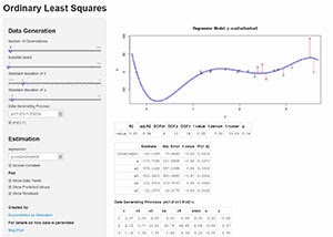
http://spark.rstudio.com/fsmart/OLS-App/Ordinary least squares continues to be the staple estimator for causal inference for good reason.  In order to help new and veteran OLS users get a better sense of how it is working I have created a shiny app that allows for instant interactivity returning coefficient estimates and prediction graphs through Shiny's easy to use user interface controls.

The app only has a single x variable which is randomly drawn from a normal distribution with mean 2 and standard deviation specified by the user.  There is also an error term u which has mean 0 and standard deviation specified by the user.

The user also has control of how many observations to generate and how to generate the dependent variable y.

To play around with the app go to: econometricsbysimulation.shinyapps.io/OLS-App/

Source can be found on GitHub: github.com/EconometricsBySimulation/OLS-demo-App/

Tuesday, August 27, 2013

Rstylizer - Shiny, Stata HTML Syntax Highlighter

I have released a shiny app through the Rstudio Spark server that allows for users to copy and paste Stata code into the app and it returns html formatted code.  The syntax structure is very easy to modify and I am looking forward to updating it when I have time, permitting extensions of the app to other languages as well as allowing users to customize the particular aspects of of the formatting such as making some commands bold or changing the color or how comments are identified.  In addition, I also hope to include an input field for users to add to language definitions, allowing for the creation of custom definitions.


[[The app can be found at: http://spark.rstudio.com/fsmart/RStylizer/]]

The git can be found at: https://github.com/EconometricsBySimulation/Rstylizer

In general the html generated is not very efficient since tags are repeated when css embedded styles is probably the preferred option.  However, since it makes very little difference in terms of load time, I figure this should work fine.  In addition, Blogger's gui seems to handle the tags better than embedded style sheets.

(I created an outdated git: https://github.com/EconometricsBySimulation/RFormatter as well but could not figure out how to change names so sorry for the messiness.)

Tuesday, June 11, 2013

More explorations of Shiny

I have continued to explore the functionality of the Shiny package released by the Rstudio team and I have been increasingly impressed.  The code fits together very clean and easy to manipulate or add to.  If you have some knowledge of html or java shiny makes an excellent opportunity for developers of web apps with backgrounds in R.

In this post I present my recent explorations of shiny which include a simple yet effective hit counter, a new screen layout allowing for three panels, and a demonstration of how to add a simple html line break to a shiny app as well as a link.  I will copy excerpts of the code dealing with these features below, though the entire code for the app can be found at https://github.com/EconometricsBySimulation/2013-06-11-Shiny-Exploration
(You will need the shiny package and the shiny incubator package)

1. Make a hit counter
The hit counter is easily made with the following code in the server.R file:
SP <- list() # Server parameters
  # Record the number of poeple who have used the app 
  #    since initiation on the server
  SP$npers <- 0

shinyServer(function(input, output) {
  # shinyServer is Started up every time the domain is called.
  # Use <<- to assign to the global server environment.
  SP$npers <<- SP$npers+1
...
}

# ui.R
...
With the ui.R file there is a single function at the appropriate place:
# Display the total number of hits on the app.
  h5(textOutput("hits")),
...

2. Allow for three panels in the user interface.  In order to accomplish this I simply modified the pageWithSidebar function replacing 'div(class = "row-fluid", sidebarPanel, mainPanel)' with 'div(class = "row-fluid", left,  middle, right)'.  I tried to write a function that more generally took ... but could not figure out the exactly right syntax.  See where the new function is defined below:

# This is a UI page with three panels
threepage <- function(headerPanel,left,middle,right) {
  bootstrapPage(div(class = "container-fluid", div(class = "row-fluid",
  headerPanel), div(class = "row-fluid", left,  middle, right)))}

3. Insert an HTML break and an external link.  Both of these things are extremely easy.  For many HTML tags there are already programmed up shiny functions which handle them.  However, there are quite a few so not all of them have a function associated with it.  A typical HTML function is br which returns:
> br()
[1] "<br/>"
attr(,"html")
[1] TRUE
if called.  In terms of HTML this command will insert a line break.  If you are interested in including HTML in which there is no function already programmed you can use the function HTML
>HTML"<hr/>"
[1] "<hr>"
attr(,"html")
[1] TRUE
In order to insert a link into shiny you could either use the HTML"<a href=>..." type html sequence or one could use the built in functions.
a(Text, href="link.com")

Personally I prefer the built in function because they are very appealing and concise for an R programmer.

Take a look at the app at:
App Link

Friday, June 7, 2013

A Shiny App Goes Viral

I am not sure how many of you have seen this Business Insider article.  It is basically about a shiny app created by Joshua Katz as NC State.  It is really fun playing with shiny app.

With nearly a million facebook likes this web app built using R with the shiny is a clear demonstration of how effective and professional shiny can be.

Though surprisingly even though the app is hosted by amazon web server it seems a bit laggy.  Given the immense traffic the article is generating I hope Joshua has some plan to pay amazon.

Though I cannot be sure because I do not have access to the code, the amazing thing is that the whole server side code developed by Joshua was probably no more than 100-200 lines of R script.
The Shiny App


The Article

Wednesday, May 29, 2013

Item Analysis App - Shiny Code

Here is the code for my first Shiny App! It is the one that I posted previously with a few slight revisions. You can see it at:

A Shiny R App
In order to make any sense of this I suggest you working through the tutorial (http://www.rstudio.com/shiny/) it would be also useful to apply for beta access to the rstudio server which provides free hosting for experimental shiny applications. To make the code below work you would need two files server.R and ui.R. Read the tutorial and you will understand their importance. After reading the tutorial and playing around a little I was able to create the following app. Hope you can do the same!
Visual Reasoning Test v0.2b


Please post as comments links to apps you have developed as well.  Also, feel free to use the data as needed.  It should continue to be updated as more people keep taking the test.


Francis

Code can be found at:

https://github.com/EconometricsBySimulation/2013-05-29-ShinyApp.git


Please tell me if I am doing this github thing wrong.  Should I have a different repo every post?
 

# server.R
library(shiny)
 
# For this app I will load in data form the visual reasoning test that I posted to this blog last week (Visual Reasoning Test Link).
 
# We have had a great deal of responses so the data is getting pretty rich!  Thanks so much :)

# I will come back to this generously generated data later!
  # Load the item response data into memory with this somewhat odd formation. con = url("http://concerto4.e-psychometrics.com/media/13/Visual.Reasoning1.RData") load(file=con) close(con) nrow(individual.responses)   # I specify input$obs initially for debugging purposes. Once this loads up on the server it is overwritten by the GUI. input = list(obs=27)   # Make a vector of values to identify the session ID for each test taker respondents = unique(individual.responses$sessionID)   # barplot(table(item.disp$user.answer), main="User Responses")     ### Item Analysis   # Create a vector of item names items = unique(individual.responses$item)   # Calculate some values that will be useful later responses.mean = tapply(individual.responses$anscorrect, individual.responses$item, mean) responses.count = tapply(individual.responses$anscorrect, individual.responses$item, length)   sum.responses = data.frame(items, mean=responses.mean, count=responses.count)   # hist(sum.responses$mean, breaks=12, col=grey(.4), main="Histogram of Item Difficulties", xlab="Probability of Correct Response")   # This function takes the min of a vector and that of a scalar or two vectors of equal length. tmin = function(v1,v2) { r = NULL if (length(v2)==1) v2=rep(v2,length(v1)) for (i in 1:length(v1)) r[i] = min(v1[i],v2[i]) return(r) } # A couple of examples tmin(1:10,5) tmin(1:10,10:1)   # END SERVER STARTUP   # Define server logic required to summarize and view the selected dataset shinyServer(function(input, output) {   # Generate a summary of the item output$summary <- renderPrint({   # I want to calculate what percent of the item responses got it right and out of all responses how that compared with other items. correct.mean = round(mean(responses.mean[input$obs]),2) percentile = round(mean(responses.mean<correct.mean),2)   dataset = individual.responses[individual.responses$item==input$obs,] loading = max(table(dataset$answer)/sum(table(dataset$answer)))   # I will save a number of text bits to combine together to a single text summary of the item. text0 = paste0("Item ", input$obs, ":\n")   text.5 = paste0("This item was taken by ", responses.count[input$obs], " respondents. ")   text1 = "This was a very easy item. As much as " if ((percentile<.80)) text1 = "This was an easy item. As much as " if ((percentile<.60)) text1 = "This was an average item. About " if ((percentile<.40)) text1 = "This was a hard item. Only " if ((percentile<.20)) text1 = "This was a very hard item. Only "   text2 = paste0(round(correct.mean,2)*100,"% of people got it correct, putting it in the ", 100-percentile*100, " percentile in terms of difficulty.")   text3 = "" if ((loading > .5) & (correct.mean<.5)) text3 = paste0(" Note that there is a large loading on a response ", round(loading,2)*100 ,"% which is not the correct one. This probably indicates that there is something wrong with this problem.")   cat(paste0(text0,text.5,text1,text2, text3)) })   # Plot Item Difficulty output$distPlot <- renderPlot({ hist(responses.mean, xlab="Probability of Correct Response", main="Difficulty Distribution") abline(v=responses.mean[input$obs], lwd=3, col="red") })   # Send item preview to the control bar output$preImage = renderImage({ # When input$n is 3, filename is ./images/image3.jpeg filename = normalizePath(file.path('Images', paste0('Q', input$obs, '.png'))) # Return a list containing the filename and alt text list(src = filename, alt = paste("Image number", input$obs)) }, deleteFile = FALSE)   # Graph bar graph of responses output$respPlot <- renderPlot({ # Grab a subset of the item.response data to display dataset = individual.responses[individual.responses$item==input$obs,]   # Set up the output for the plots that we would like. par(mfrow=c(1,2))   # Select the color of the bar which if the right answer to be red. barcol = c("grey", "grey", "grey", "grey", "grey") barcol[sort(unique(individual.responses$correct))==dataset$correct[1]]="red" barplot(table(dataset$answer), col=barcol, main=paste0("Correct Response=",dataset$correct[1]))   # Calculate the average number of correct responses per ten items. avg.correct = tapply(dataset$anscorrect, ceiling((1:length(dataset$correct))/10), mean) # Plot those respones over time. plot(avg.correct, xaxt = "n", type="b", ylab="", xlab="", main="Performance over time", ylim=c(0,1)) # Change the x axis to have custom tick labels. navgs = length(avg.correct) axis(1, at=1:length(avg.correct), paste0(1+(1:length(avg.correct)-1)*10,"/", (tmin((1:length(avg.correct))*10,length(dataset[[1]]))))) })   # Show a table of all of the item response values. output$view = renderTable({ # Select the subset of data that pertains to the item selected. dataset = individual.responses[individual.responses$item==input$obs,] rownames(dataset) <- 1:nrow(dataset) dataset$ip <- dataset$item <- dataset$id <- NULL dataset }, digits=0) })

# ui.R
library(shiny)
 
# Define UI for dataset viewer application
shinyUI(pageWithSidebar(
 
  # Application title.
  headerPanel("Visual Reasoning - Item Response Evaluation"),
 
  # This is the left hand panel.
  sidebarPanel(
    # This image is just loaded from another image and placed as a thumbnail into the shiny GUI.
      imageOutput("preImage", width = "100px", height = "100px"),
 
    # This allows the user to specify what the look of this input device will be.
    # In this case a slider that has a min of 1 and max of 92.
    sliderInput("obs", "Choose Item:", 
                min = 1, max = 92, value = 1, step= 1, 
                ticks=c(1,25,50,75,92) , animate=TRUE), 
 
    # This is the histogram of item difficulty
    plotOutput("distPlot", height = "300px"),
 
    # This displays text below the histogram
    helpText("Though histograms are organized into bins we know exactly in the range from 0 to 1 where this particular item falls.")          
  ),
 
  # Now let's define the main panel.
  mainPanel(
    # Display the title.
    h4("Item Summary"),
    # Display the item summary table.
    verbatimTextOutput("summary"),
 
    # Display sub heading.
    h4("User Responses"),
    # Display user response table.
    plotOutput("respPlot", height = "300px"),
    # Display the note.
    helpText("Note: Answer values are masked to mitigate potential cheating."),
 
    # Display sub heading
    h4("Observations"),
    # Display the table output of item responses.
    tableOutput("view"),
 
    helpText("Order is the order that the item was given in in this particular user's experience.")  
  )
))

Syntax Highlighting by Pretty R at inside-R.org